
Building Responsive Web Designs: Grids and Wireframe
You found this great article online. You click to it on your smartphone with anticipation and"¦ GAH, forget it. Who wants to deal with all that zooming and scrolling (let alone trying to click on anything). Without a responsive website design the impact of your content via smartphones or tablets will be zilch.
Let's avoid that and talk about how to achieve a website design that adapts perfectly to all screen sizes. The necessary ingredients are:
- Flexible grids and wireframes.
- Flexible images and typography.
- Testing tools.
In this three-part series on Tools for Responsive Web Design, we will show you some intriguing and useful online tools that will make viewing and navigating your site enjoyable for your website visitors regardless of the size or resolution of their screen.
Here is a list of Responsive Website Design tools for grids, (in no specific order):
1. Bootstrap:
A free responsive web design framework developed by Mark Otto and Jacob Thornton at Twitter, Bootstrap provides a set of compiled and minified CSS and JavaScript. You can customize and remove code bloat to improve page speed (this feature is temporarily disabled until the release of Bootstrap 3 RC2). Opt for Bootstrap because of its proper documentation, compatibility with HTML5 and CSS3, quick integration capability on a live site and its JavaScript library.

Bootstrap for Responsive Web Design
Foundation4 gives you a 12-column flexible grid and simplifies things so you don't have to build a lot of custom elements. You can build a responsive design prototype with Foundation4 that includes multiple button sizes and styles, tabs, custom form elements, image sliders and more. The site gives you appropriate documentation for the framework. It also has a training program for newbies.

Foundation4 from Zurb for Responsive Web Design
3. Skeleton:
Skeleton is a free, pure CSS framework. The base grid is the 960 grid system but can be easily downsized to all browser sizes, as well as mobile and tablet screens in both landscape and portrait. It is one of the most lightweight and simple grid systems and is easy to get up and running.

Skeleton for Responsive Web Design
With Semantic Grid System you can design responsive grid layouts without any .grid_x classes in your markup. It gives you pre-processed CSS extensions, such as LESS, SCSS or Stylus. These extensions help modify the number of columns, column width and gutter width directly and instantly in the style sheet.

The Semantic Grid System for Responsive Web Design
5. LessFramework 4:
Based on a single grid layout, LessFramework is free and has four sets of web layouts; default for desktops and laptops, tablet layout for tablets and iPads, mobile layout for iPhones, iPod touch and other smartphones and an extra wide mobile layout that consists of elements from both the default and mobile layouts for wide mobile screens.

Less Framework for Responsive Website Design
6.Golden Grid System:
The Golden Grid system is not a complete framework but is a starting point for your responsive grid system. It gives you elastic gutters to ensure that you create proportional content according to the screen size and also gives you a baseline grid that can zoom. The page offers you four downloads, namely, GGS.html, GGS.css, GGS.less/GGS.scss and GGS.js.

Golden Grid System for Responsive Website Design
7. 320 and Up:
This is a lightweight responsive web design markup that was designed in reverse; i.e. from small screen to large. The new 320 and Up consists of five CSS3 media query increments: 480, 600, 768, 992 and 1382px. It uses CSS extensions such as LESS and Sass mixins and variables. You can customize the HTML and LESS CSS imports.

320 and Up for Responsive Website Design
8. Gridless:
An HTML5 and CSS3 boilerplate for making responsive website designs, Gridless is an open-source tool that is simple and straightforward to use. It features beautiful typography, CSS normalization and IE bug-fixes. It even works on old feature phones and digital devices that do not necessarily support media queries.

Gridless for Responsive Website Design
9. The Goldilocks Approach:
The Goldilocks Approach looks at design from a different perspective. Rather than just restricting the responsive design to device resolution and pixels, it uses ems to make the design resolution independent. With Goldilocks you only have to consider a multi column, narrow column or single column approach. They believe in designing for readability rather than designing to technological constraints (such as screen variations).

The Goldilocks Approach for Responsive Web Design
10. Gumby 2:
Built with the powerful CSS preprocessor Sass, Gumby2 is a responsive web-design framework that is easy to download and customize according to your needs. From responsive images to intrinsic ratio video embeds, Gumby2 has a robust collection of tools for grids, forms, buttons, toggles and switches, Entypo icons, dropdowns, tabs, drawers and templates.

Gumby2 for Responsive Website Design
Both fluid and fixed grid systems are available on this grid framework tool that was built based on the 960 Grid System by Nathan Smith. This is a great tool for web designers who are well versed with 960.gs.

Fluid 960 for Responsive Web Design
Here are tools for responsive wireframes:
Want to know how your responsive website would look on desktop and mobile devices? Take a look at Responsive Wireframes, made with HTML and CSS. It gives you five ready-made wireframes meant for the home page, guided entry page, promo entry page, product detail page and comparison page.

Responsive Wireframes for Responsive Website Design
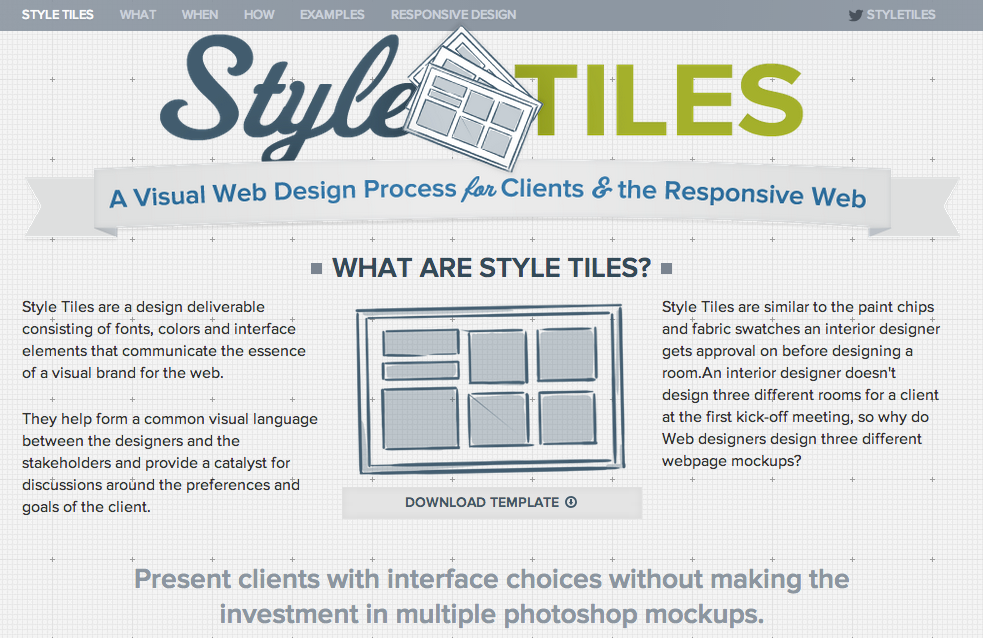
13. Style Tiles:
Developing an idea of how you want your website to look is simplified with Style Tiles. It helps you visualize your responsive website design layout before you design full web pages.
StyleTiles for Responsive Website Design
14. Multi-Device Layout Patterns:
This is a resource that gives you a head start on which layout patterns to choose for your responsive design and why.

Multi-Device Layout Patterns for Responsive Website Design
15. Responsive Web Design Sketch Sheets:
Download the zip file of sketch sheets to help you map out the placement of various elements of your responsive website design.

Responsive Web Design Sketch Sheets
In Tools for Responsive Web Design Part II we will give you a list of tools to help you design responsive images and typography. We hope you enjoy using the tools on this list!
We'd love to hear about your experience of creating a responsive website design. Have you used any of the tools mentioned in this blog?