
Tips and Tools for Creating Mobile Websites
In this article, we will discuss the reasons for having a mobile version of your website; why it is necessary. We will also cover a list of useful tools that will help you build a mobile-friendly website.
Let's Start With Some 'Did You Know' Statistics:
- Thirty eight percent of American consumers of smartphones use an iPhone; however Android devices lead the race of smartphone users at 51 percent, according to the Adobe 2012 Mobile Consumer Survey.
- Fifty eight percent of the younger population uses Android devices.
- Among smartphone and tablet users, 88 percent are hooked on smartphones.
- Most shopping on mobile devices is done by smartphone users rather than tablet users.
- It is predicted that tablet users' online activities would surpass that of smartphone users' in 2013 and 2014. They are found to spend more on consumer products, as evidenced by the following statistics: Sixty two percent of iPad and 56 percent of Android Tablet users spent, on average, more than $250 on consumer goods in 2012. Only 58 percent of iPhone and 53 percent of Android smartphone users fit into that category.
- When it comes to preferences between a mobile website and a mobile app, mobile websites turn out to be the most preferred option.
- Speed and ease of navigation are the most expected performance aspects of a mobile website. Fifty eight percent of mobile users expect mobile sites to load faster than desktop sites. Thirty eight percent of mobile shoppers will wait for 30 seconds or less to complete a transaction.
- If a website is not mobile-friendly, 40 percent of mobile shoppers would visit a competitor site instead.
- Shopping queries on mobile devices double during the holiday season.
Now that you've had a reality check concerning mobile users of the web, here are some more reasons you need a mobile friendly website.
Why Do Mobile-Friendly Sites Matter?
Let's learn from previous decades of technological boom, shall we? If you had asked a business to operate a website in the early 90's they would never have taken you seriously. Some businesses never gave any thought to the untapped potential of online shoppers. They assumed that users felt more secure shopping at physical stores. However, there were some early adopters of the internet who immediately built a website to have an edge over their competitors. In the end the rest were just playing catch-up once it became obvious that the online shopping trend had spread like wildfire.
Do not expect the mobile browsing scenario to behave in the same manner. The mobile shopping trend has already caught on with many users of smartphones. The use of the mobile web has accelerated eight times faster than the speed at which the internet enticed users worldwide.
So, the message is quite clear; you either have a mobile-friendly website, or you have a mobile-friendly website. That's right, there is no second option.
Top Six Features of a Mobile-Friendly Website:
1. Speed:
This necessary feature is common to both regular websites and mobile websites. It keeps online customers engaged and interested. It is found that with every one second delay in mobile website loading, seven percent of conversion opportunity is lost. Ideally your mobile site must load in less than five seconds.
The following are ways to optimize your mobile website for speed:
- Avoid heavy images.
- Do not use flash, instead use HTML5 or JQuery for animations.
- Reduce code.
- Remove unnecessary tags and comments.
- Prioritize content and use bullet texts.
You must take into consideration the connectivity, limited battery life, browsing time span and short attention span that a mobile user is usually faced with. Keep your mobile website simple and quick to load on all mobile and tablet devices.
2. Easy Navigation:
Navigation is one of the major factors that can dictate whether your mobile visitor sticks to your website or dumps it for your competition.
The following are some top navigation tips for mobile-friendly websites:
- The website must have vertical scrolling only.
- A search bar, preferably placed on the top, is useful when it's a complex website with a lot of information.
- Have a _call option _at the top with a phone number displayed on it. This also acts as your website's call-to-action button.
- Back and Home buttons must be made prominent on each webpage.
- For longer web pages, Back-to-Top options must be provided.
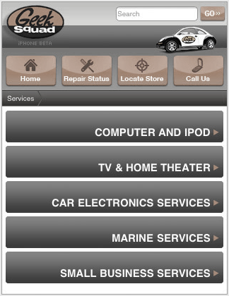
Here is a sample mobile website with ideal navigation elements, as shown below:
3. Easy Data Input with Finger-Friendly Design:
Most smartphones today have touchscreens. To enhance your mobile website usability, it needs to be finger-friendly.
The following are tips to enhance finger-friendly features of a mobile website:
- Make use of at least 30 to 40 pixels for your mobile website buttons.
- Buttons must be large enough for an adult human finger to press comfortably.
- Buttons must have extended padding that spans the width of the screen. This increases the clickable area.
- Drop down menus must be used wherever possible.
- Users must be given opt-out or opt-in check boxes wherever applicable.
- Forms must have pre-populated fields with data retrieved by using the phone's built-in features, such as GPS.
- You may provide QR codes or barcodes that can be scanned by supporting devices.
Look at this sample mobile website that offers a finger-friendly design, as shown below:

A Mobile Website with Finger-Friendly Design
4. Optimized Readability:
Some of the best mobile sites offer enhanced readability on various screen resolutions.
The features that ensure optimized readability of mobile websites are as follows:
- Black or White Background must be used for high contrast with text color.
- No more than three solid colors must be used for the core design.
- Mobile-friendly fonts such as Arial/Helvetica, Courier/Courier New, Georgia, Times New Roman, Trebuchet MS and Verdana are ideal.
- Meta Viewport Tag is used to fit the font size on all screen resolutions. The meta tag must be used in , in the format shown below:

- Your mobile site must have a Fluid website layout. This is to ensure that when the mobile screen orientation is changed from vertical to horizontal the page will fit both screens with the same resolution and identical page elements.
- White space must be used generously.
- Shadow effects or 3D effects can be used for buttons to make them prominent and clickable at the same time.
5. Switch between Mobile and Desktop Site:
You can choose a separate URL for your mobile site. If you can add subdomains to your existing domain use a URL such as http://mobile.yoursite.com or http://m.yoursite.com. You may also consider an easy-to-remember URL such as
<http: www.yoursite.com="" mobile="">.
Mobile-friendly websites use a mobile redirect that allows smartphone users to land on your mobile site rather than the desktop site. But first you must know how to configure your site to detect the device your user is on. Read more about detecting the user device and redirecting your mobile website here.
Some users might want to utilize a feature or a piece of information that is available on your main website, but not on your mobile site. It is therefore recommended to have a link to the full site at a prominent location on your mobile webpage. Similarly, include a link on your desktop site to get back to the mobile site.
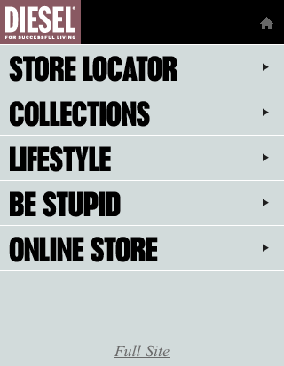
Mobile-friendly websites facilitate switching between mobile and desktop site options with a link to the full site at the bottom or top of the page, as shown below:
6. Optimized for Conversions:
While all the factors mentioned above enhance conversion rates of mobile sites, the following are some other features that lead to higher conversion rates:
- Fewer steps to make a quick transaction.
- Short lead forms with required fields only.
- Store locator placed prominently on the homepage.
- Maps included to give directions.
- Prominent access to shopping cart and saved favorites.
Tools to Create a Mobile Friendly Website:
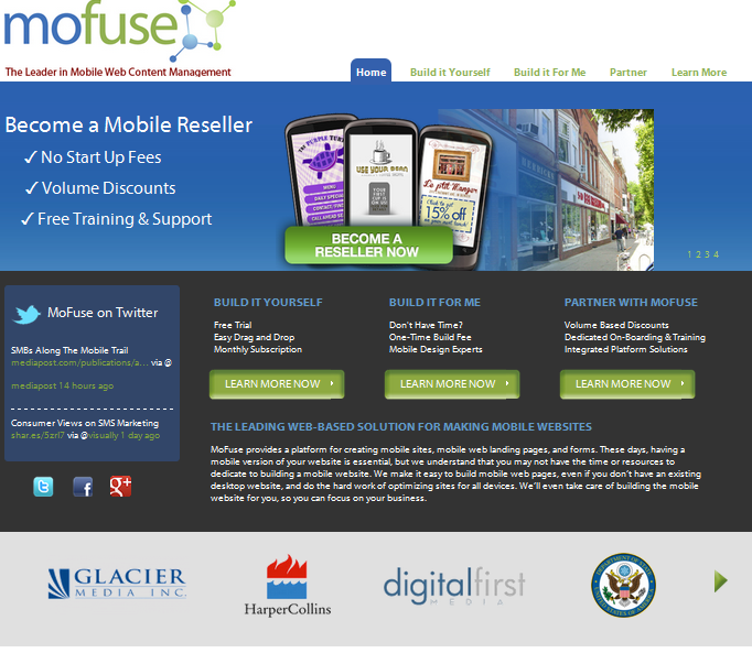
Build and manage a mobile website either by yourself or with the Mofuse team. Here are pricing plans for build-it-yourself and build-it-for-me packages. These plans come with a free trial period as well.
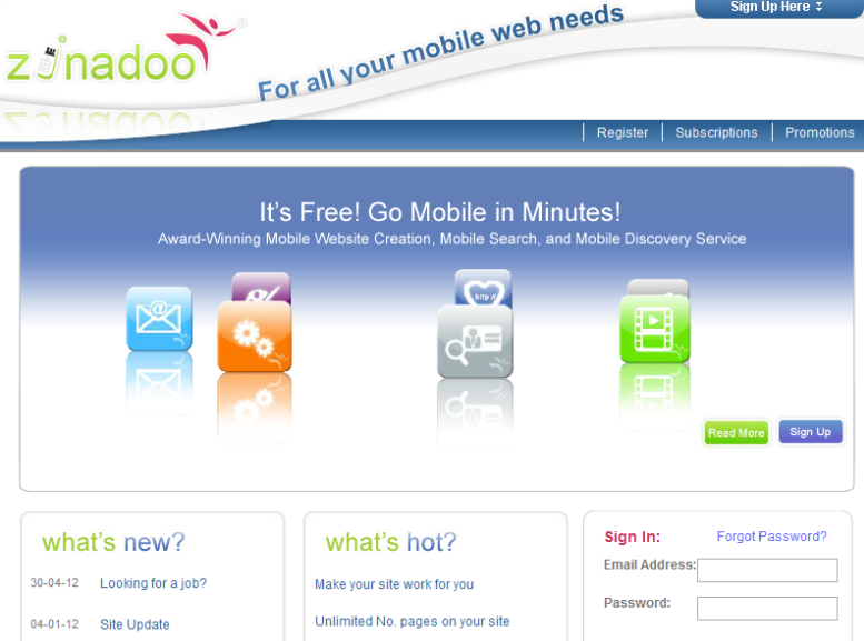
Zinadoo is a free tool that offers mobile site creation with quick and easy steps. You can optimize your site for Google mobile with keywords and tags. Zinadoo also facilitates video uploads using Zinadoo's Mobile Video.
Create and customize up to 10 web pages for free. It comes with an analytics account as well, however, with a free plan your mobile website URL is hosted on DudaMobile site and looks like ''//dudamobile.com/yourcompany''. Check out other plans from DudaMobile.

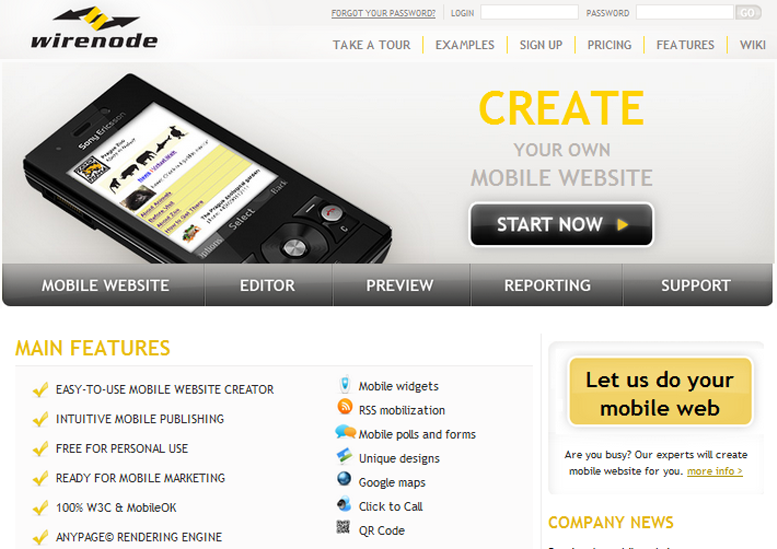
You can create one mobile website for free with Wirenode and have access to analytics, mobile SEO, mobile widgets and hosting. The mobile site created is 100% W3C and mobileOK compliant. View pricing plans from Wirenode.
GoMobile is a fast and free mobile site creation tool for small businesses, marketers, developers, event marketers and so on. You can style your site with pre-defined themes. Every site gets its own unique QR code and they also give access to your site statistics.

Create a quick mobile site with their basic free plan. You can choose from the various templates Onbile provides.

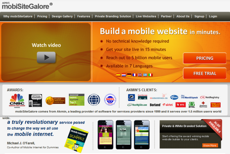
MobiSiteGalore enables you to build your own website by offering DIY website building solutions for both PC and mobile. They have yearly packages with unlimited hosting and a range of design templates to work with. The mobile websites created by mobiSiteGalore are 100% W3C and mobileOK compliant and offer 99.99 percent uptime guarantee on hosting.
Mippin is a free service to make mobile versions of an RSS-driven site. It helps build an HTML5 app builder platform that is compatible with any phone.

Mobify helps you build a mobile website that works on smartphones, iPads and tablets. It is built on a JavaScript framework that uses standards, such as CSS and HTML5. It allows you to use one URL for all devices and includes the option for a custom domain. It is optimized for loading time and resizing images. It is free but to use it you need to sign up on their website.

Tools that Help You Test Your Mobile Site:
Have a quick look at how your desktop website looks on a mobile screen. At no extra cost you get a downloadable report on features of the website that need improvement.
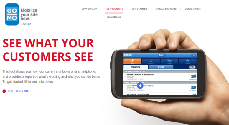
GoMo Test
This is another free tool that allows you to have a preview of what your website/mobile website looks like on smartphone screens. It also includes a free report of any problems that the mobile version of your site has and tips on how to fix them.
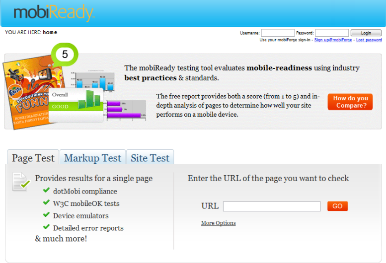
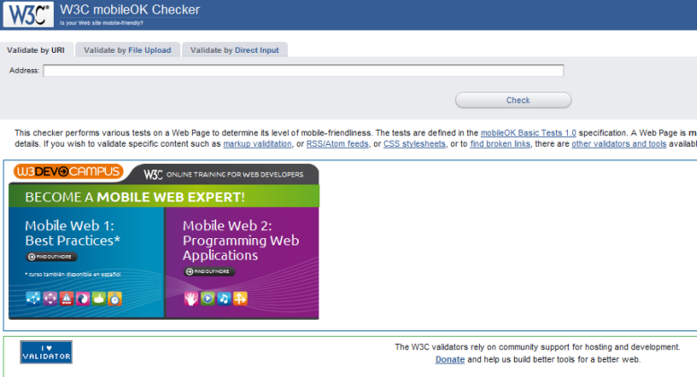
This is a free service from W3C that allows you to check how mobile-friendly your website is. It also gives an extensive report on factors that render your site mobile-friendly.
iPadPeek offers a simple and easy way to see how your website looks on an iPad or iPhone, in both vertical and horizontal orientations. It gives you a quick peek at the mobile layout of your website on Apple Products, for free.
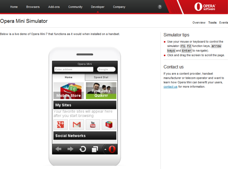
Similar to iPadpeek, this is a smartphone simulator that gives you a quick peek at how your website would look and operate on a smartphone. It is free to use.
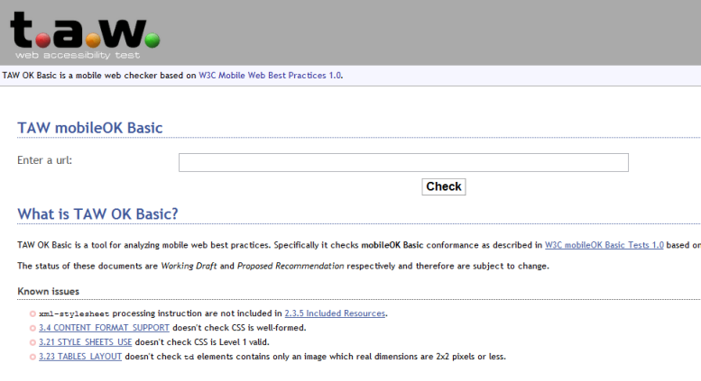
t.a.w Web Accessibility Test is a mobileOK basic checker that gives you a list of mobileOK compliant factors for your mobile website.
These tools and resources will set you up for an initial phase of building and testing your mobile site. Once you have a mobile site ready and working, check what the analytics say about your mobile visitors. Optimize your site elements according to the visitor behavior on your mobile site. A sample screenshot of Google Analytics for mobile visitors is shown below:
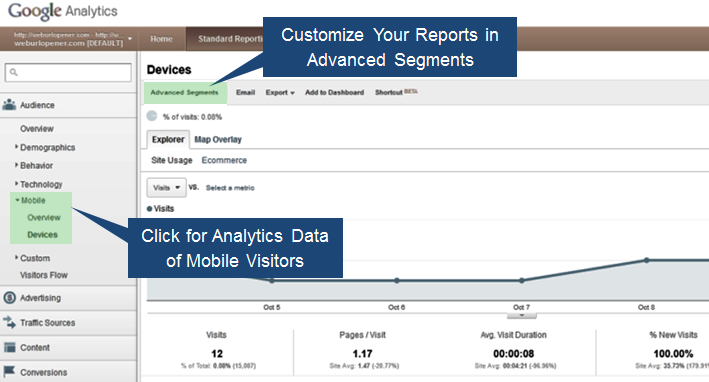
Google Analytics Feature for Mobile Websites
Read the W3C guidelines on Mobile Web Best Practices 1.0 for a better understanding of optimization standards for your mobile website.